2020–2026
Soramitsu Corporate Brand
Corporate identity and brand system for a global blockchain company
Building and maintaining the corporate identity, multi-brand architecture, and visual communications for Soramitsu, from a logo without a system to a comprehensive brand platform spanning multiple product brands.
What I Inherited
When I joined Soramitsu in February 2020, the company had a strong logo and not much else. The mark. A red circle (echoing the Japanese flag) with a negative-space cutout depicting two clouds above the top of a Torii gate, was distinctive, culturally grounded, and technically well-crafted. There was also one beautifully fitting hero photograph: a majestic red Torii gate shot that perfectly embodied the brand's Japanese identity.
But there was no system around it. No brand guidelines. No responsive logo variants. No structured relationship between the corporate brand and the growing family of product brands. No templates for press releases, proposals, and government-facing documents. No visual communications strategy for a company that was simultaneously a Japanese enterprise technology firm, an open-source community contributor, a DeFi startup, and a partner to sovereign governments.
The brand needed architecture.
Responsive Logo System
My first major brand initiative was creating a comprehensive responsive logo system. A company operating across business cards, mobile apps, press releases, social media avatars, government presentation decks, trade show banners, and product interfaces needs a logo that performs at every scale and in every layout context.
I developed 8+ logo variants organized by two axes, orientation (portrait/landscape) and density (standard/oversized/compact). Each variant has defined minimum sizes, clear-space rules, and usage guidelines specifying when to use which configuration.
Anniversary Logo Series
Starting in 2021, when Soramitsu turned five (founded February 2016), we established a tradition of annual anniversary logos. Each year, a unique motif is designed to sit within the Soramitsu logomark — specifically inside the Torii gate's negative space, creating a commemorative variant used across social media, company materials, and internal communications.
- ·5 Years (2021): A five-pointed star, nested symmetrically within the Torii gate motif. Geometric and celebratory.
- ·6 Years (2022): A six-leafed pinwheel/flower form, organic and dynamic, suggesting growth and momentum.
- ·7 Years (2023): The kanji 七 (shichi/nana, seven), introducing Japanese calligraphic elements directly into the mark.
- ·8 Years (2024): The kanji 八 (hachi, eight), with upward-spreading strokes suggesting expansion and prosperity.
- ·2025: A clean, minimal treatment. The logo paired simply with "2016–2025" without an interior motif.
This series is a small detail in the broader portfolio, but it's one I'm proud of. It shows how a brand system can accommodate creativity without losing coherence — and it gave the company a recurring moment of cultural identity each year.
Visual Communications
Press & Documents
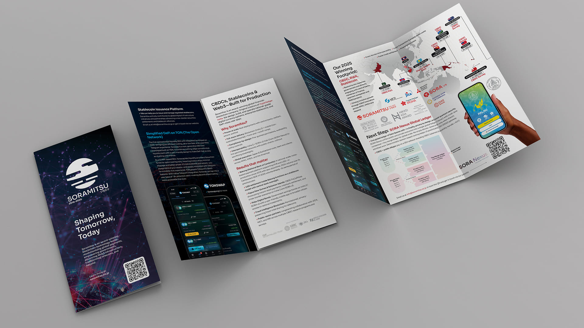
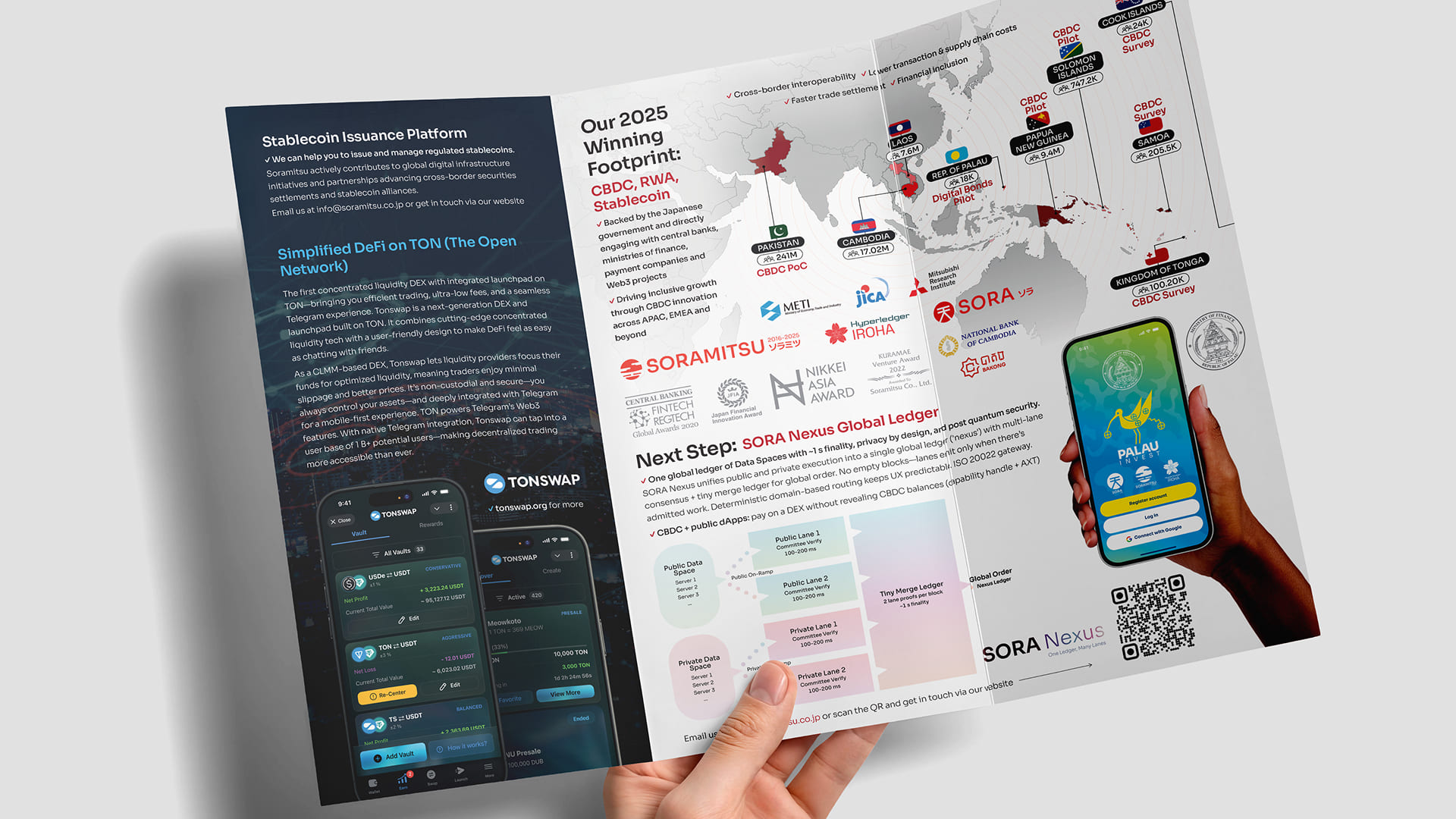
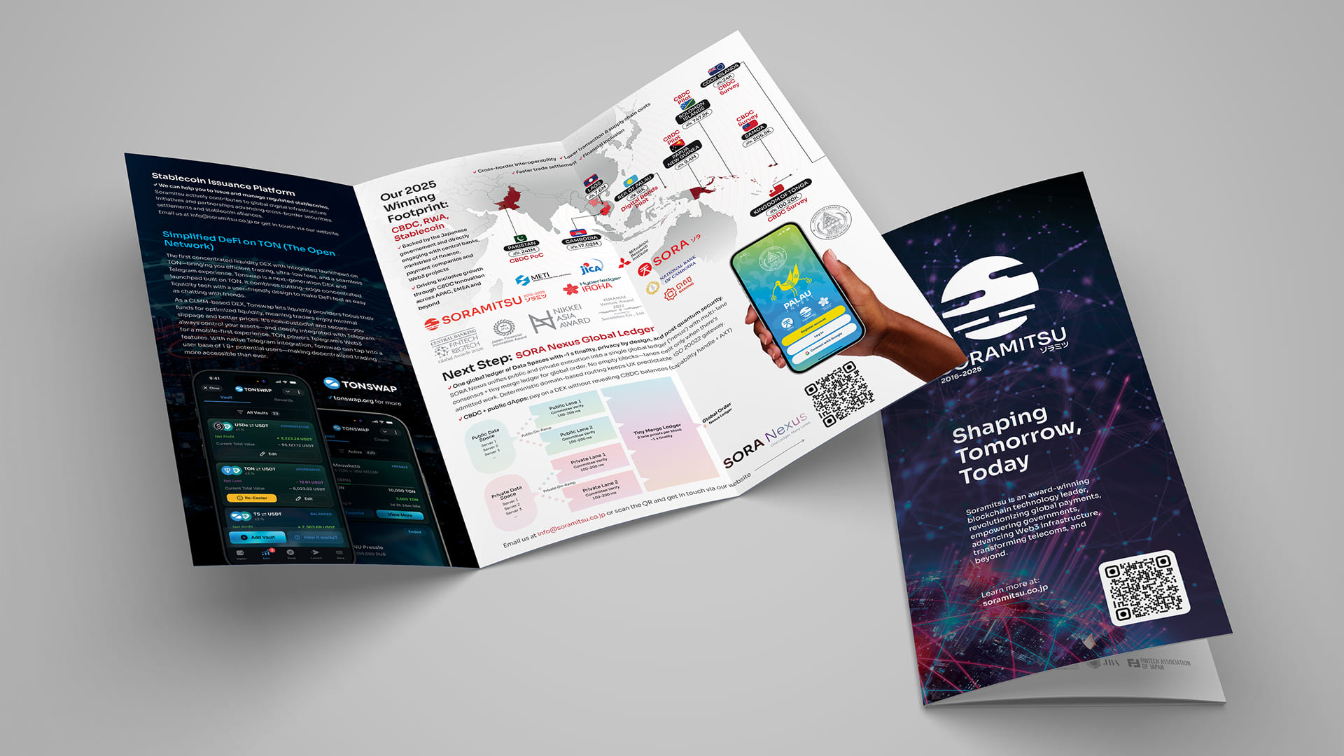
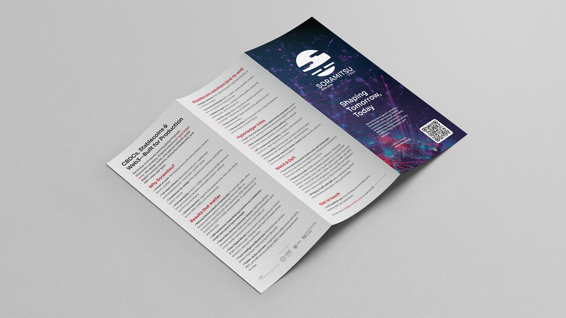
Standardized press release templates, proposal templates for government and central bank pitches, corporate one-pagers (English and Japanese versions, regularly updated), and brochures for different audiences. The most recent 2025 brochure and one-pager represent the most refined versions of formats that were continuously improved across multiple iterations.
Seasonal & Cultural
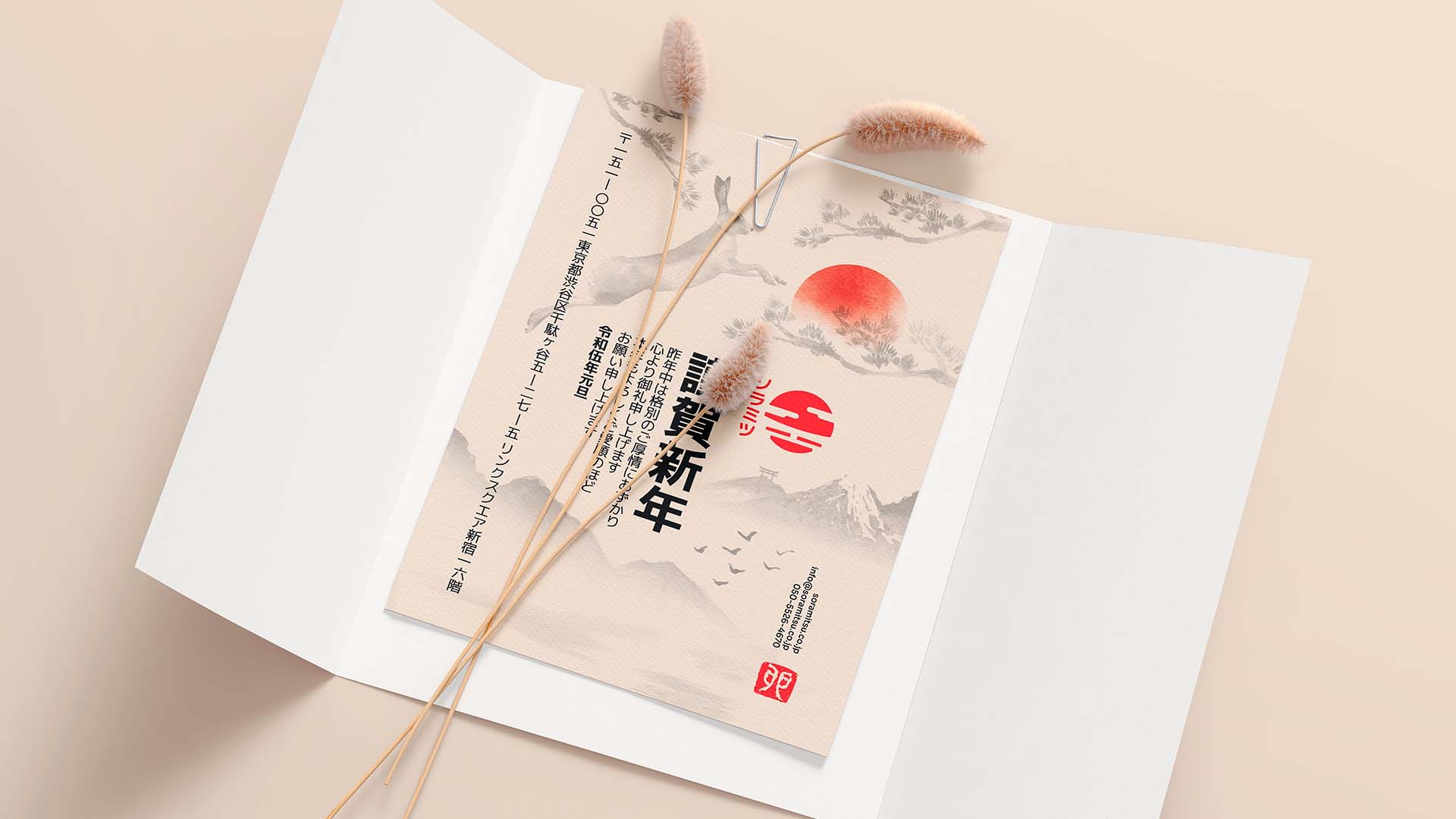
Annual New Year cards (年賀状 / nengajō). A significant Japanese business tradition. Each year's card was designed as a showcase piece: the Year of the Ox (2021) in bold red with gold illustration; the Year of the Tiger (2022) as a vibrant 3D-rendered scene; the Year of the Rabbit (2023) as an elegant sumi-e watercolor. These cards were sent to partners, clients, and government contacts across Japan and Asia — they needed to be culturally impeccable and visually distinctive.
Brand Collateral
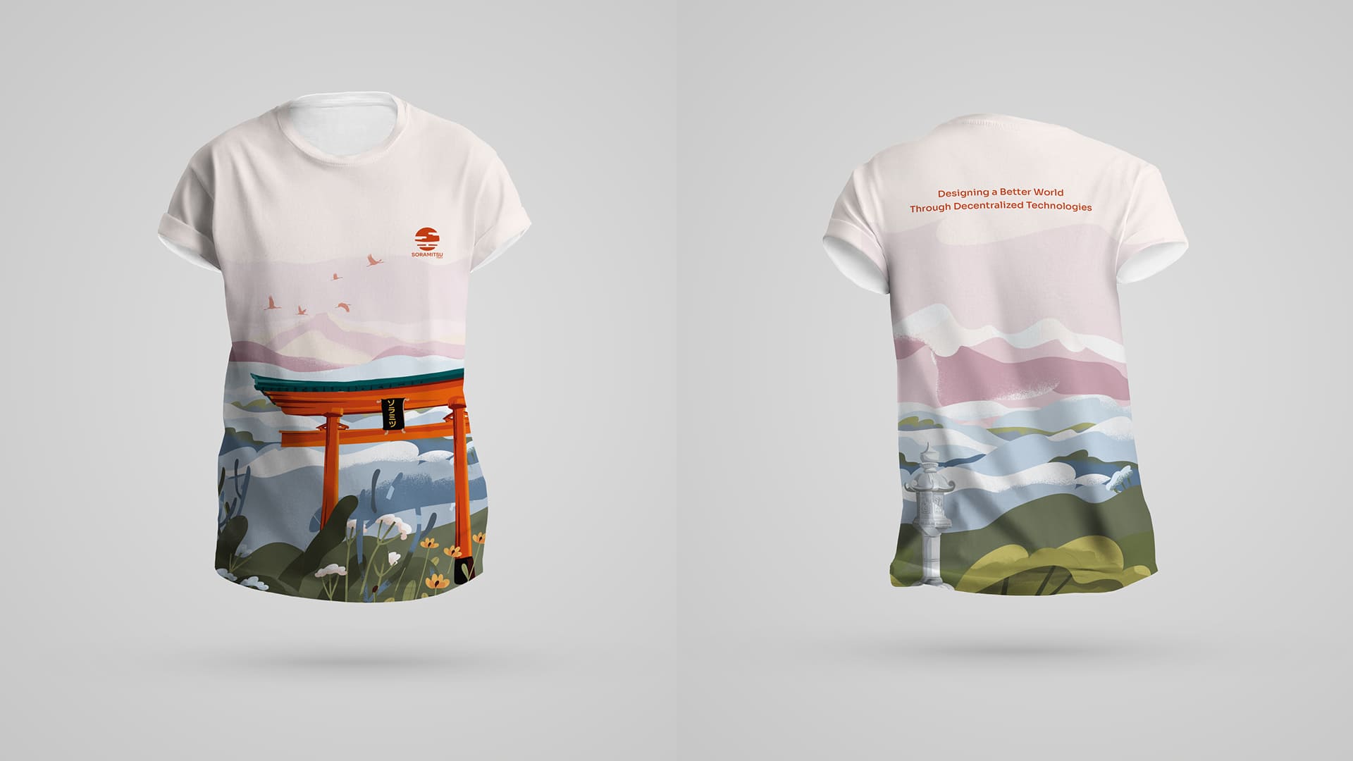
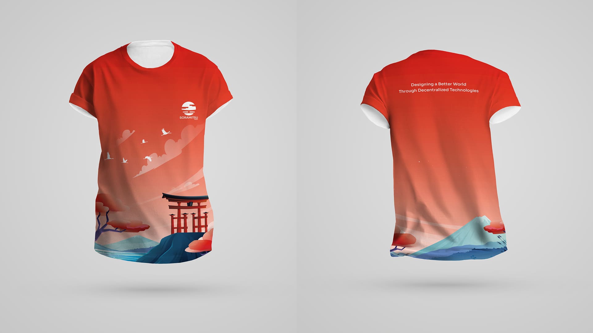
Business cards, branded stickers (including an illustrated cat-with-laptop design that became an internal favorite), t-shirts, and conference materials. Video production for corporate brand films and product demonstrations.
Corporate Website
The soramitsu.co.jp website went through multiple iterations, with the most comprehensive update in 2025 consolidating the company's full portfolio into a single, well-structured corporate site.
Impact
Reflections
Corporate brand is infrastructure, not a project. Unlike a product brand that ships and then evolves incrementally, a corporate brand is a living system that needs continuous attention. New products need to be integrated into the architecture. New milestones deserve thoughtful celebration.
Working for a Japanese company, producing materials for Japanese government level communication, and maintaining traditions like annual nengajō taught me that brand design in this context isn't just visual communication, it's a form of cultural participation. The details that matter (auspicious color choices, seasonal appropriateness) aren't optional polish; they're fundamental requirements.