2020–2025
Fearless Wallet
The DeFi wallet that brought Polkadot to 300K+ users
The Opportunity
In 2020, the Polkadot and Kusama ecosystems were growing rapidly, but there was no native mobile wallet. The only interface available was Polkadot.js, a browser-based tool built for developers. For anyone who wasn't a blockchain engineer, participating in this new ecosystem (staking tokens, contributing to crowdloans, managing assets across parachains) was intimidating, confusing, and often risky.
We saw a massive gap: an emerging multi-billion dollar ecosystem with no mobile-first, user-friendly entry point. Millions of potential users were being locked out by poor UX.
Soramitsu, a Japanese fintech company already embedded in the Polkadot ecosystem through infrastructure work on Kagome (C++ implementation of Polkadot), SORA Network and Polkaswap, was uniquely positioned to fill this gap. But first, we needed to convince the community to fund it.
Starting from Zero: Brand, Vision, Mockups
I joined the project at the very beginning, when we had a concept and not much else. My first task was to give this thing a soul.
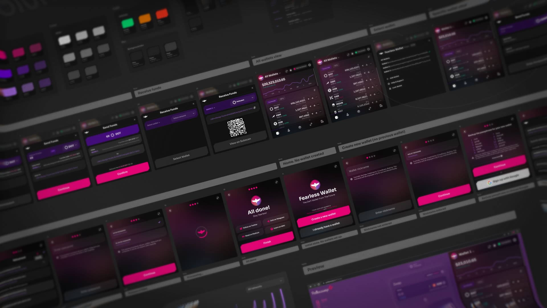
I created the entire visual brand and identity from scratch. The name already existed, but the visual world around it didn't. I developed a design language rooted in cyberpunk aesthetics, futuristic Japanese anime influences, and bold, high-contrast color palettes. The idea was to create something that felt as fearless as the name implied: unapologetically bold, technically sophisticated, yet approachable.
Before the engineering team had figured out what exactly we'd build, I designed the first mobile app mockups. These weren't wireframes. They were fully realized, high-fidelity screens that told the story of what the product could be. They painted a picture of a polished, premium mobile experience in an ecosystem where nothing like it existed.
These early mockups played a critical role. They were presented to the Kusama community as part of our treasury proposal, and they helped generate early buzz and excitement. The Kusama Assembly and KSM token holders voted to fund the project. A decentralized community literally putting their tokens behind our design vision, and the visual quality and clarity of what we were proposing helped build confidence that Soramitsu could deliver something genuinely different.
Building the Product: From Launch to Ecosystem Staple
Launch (Late 2020)
We shipped Fearless Wallet on iOS and Android simultaneously. At launch, I was working with two product designers alongside the product owner and engineering team lead, working across screens while establishing the design direction and UI style guide that would govern the product for years to come.
The core design principle was radical simplicity for an inherently complex domain. We made decisions early on that set us apart:
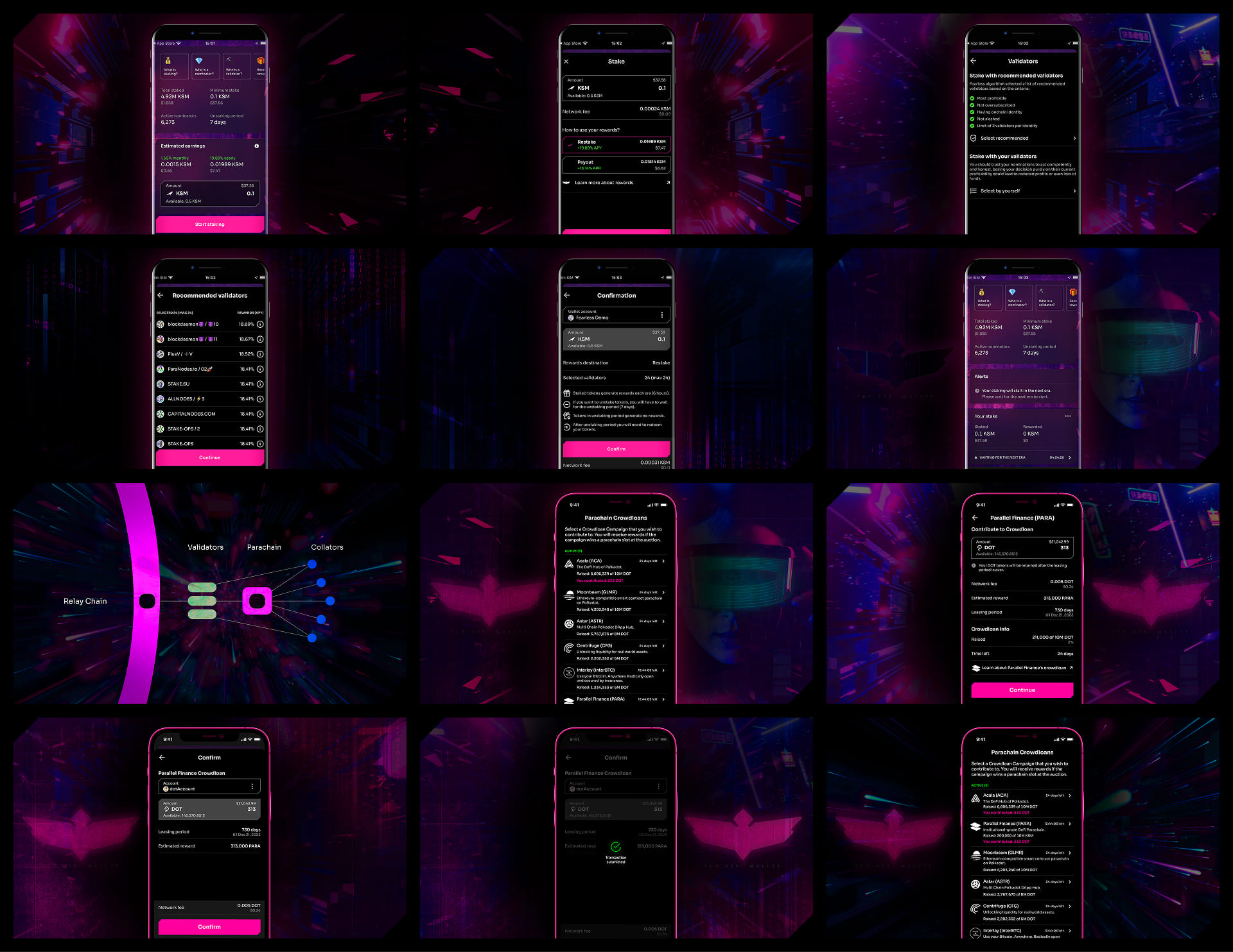
- ·3-tap staking flow. Polkadot staking involves selecting validators, understanding bonding periods, managing nomination lists. We abstracted this into a guided flow that anyone could complete in seconds, backed by a custom algorithm that selected optimal validators automatically.
- ·2-click crowdloan participation. When Polkadot parachain auctions launched in 2021, contributing to crowdloans on other platforms required navigating complex interfaces. Fearless Wallet made it almost effortless, and this became our breakout moment.
- ·Built-in education. Every complex action came with contextual educational materials. Instead of assuming knowledge, we met users where they were.
- ·Security as UX. Scam address warnings, network failure alerts, existential deposit safeguards. We built protective patterns directly into the flow rather than burying them in settings.
The Crowdloan Effect (2021–2022)
The Polkadot and Kusama parachain auctions became a major ecosystem event, with projects competing for parachain slots and communities rallying to support them. Fearless Wallet became one of the go-to tools for participating. The friction-free crowdloan UX drove a massive wave of organic adoption.
By mid-2022, the wallet had surpassed 130,000 organic users with over 50,000 monthly active users and 1 million+ daily requests to blockchain nodes. We'd become one of the most recognized wallets in the Polkadot ecosystem, listed on the official Polkadot Wiki, featured on Polkadot's support portal, and consistently recommended across community channels.
The Design Work: Evolving a Living Product
Brand Evolution
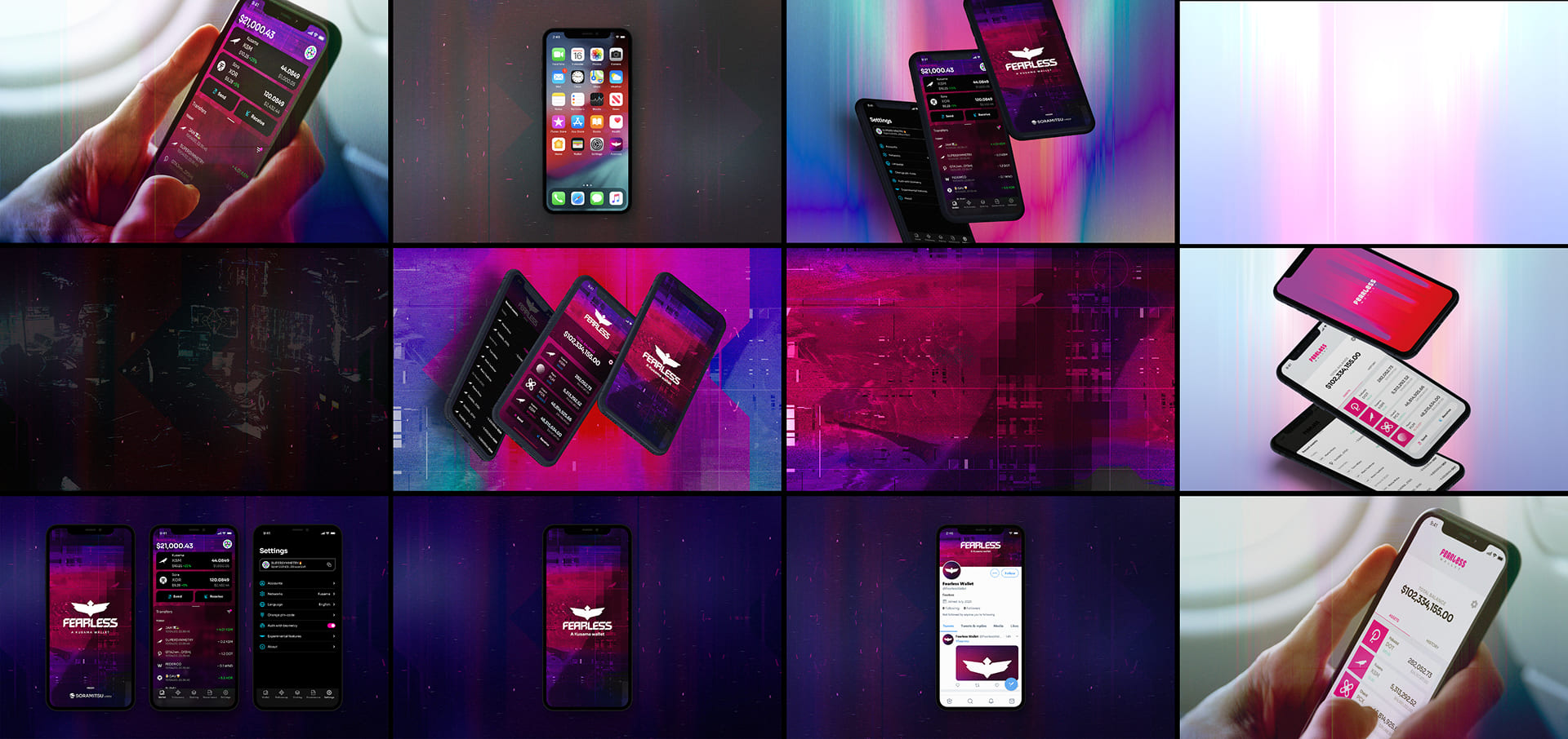
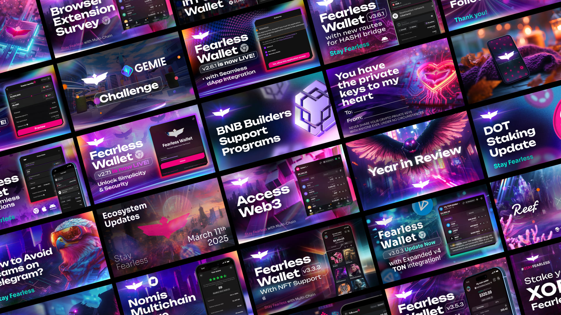
The Fearless Wallet brand wasn't static. Over five years, I led multiple visual "facelifts," evolving the design language while maintaining the core identity. Each iteration refreshed the product's energy, kept the visual experience feeling current, and signaled to users that the product was alive and moving forward.
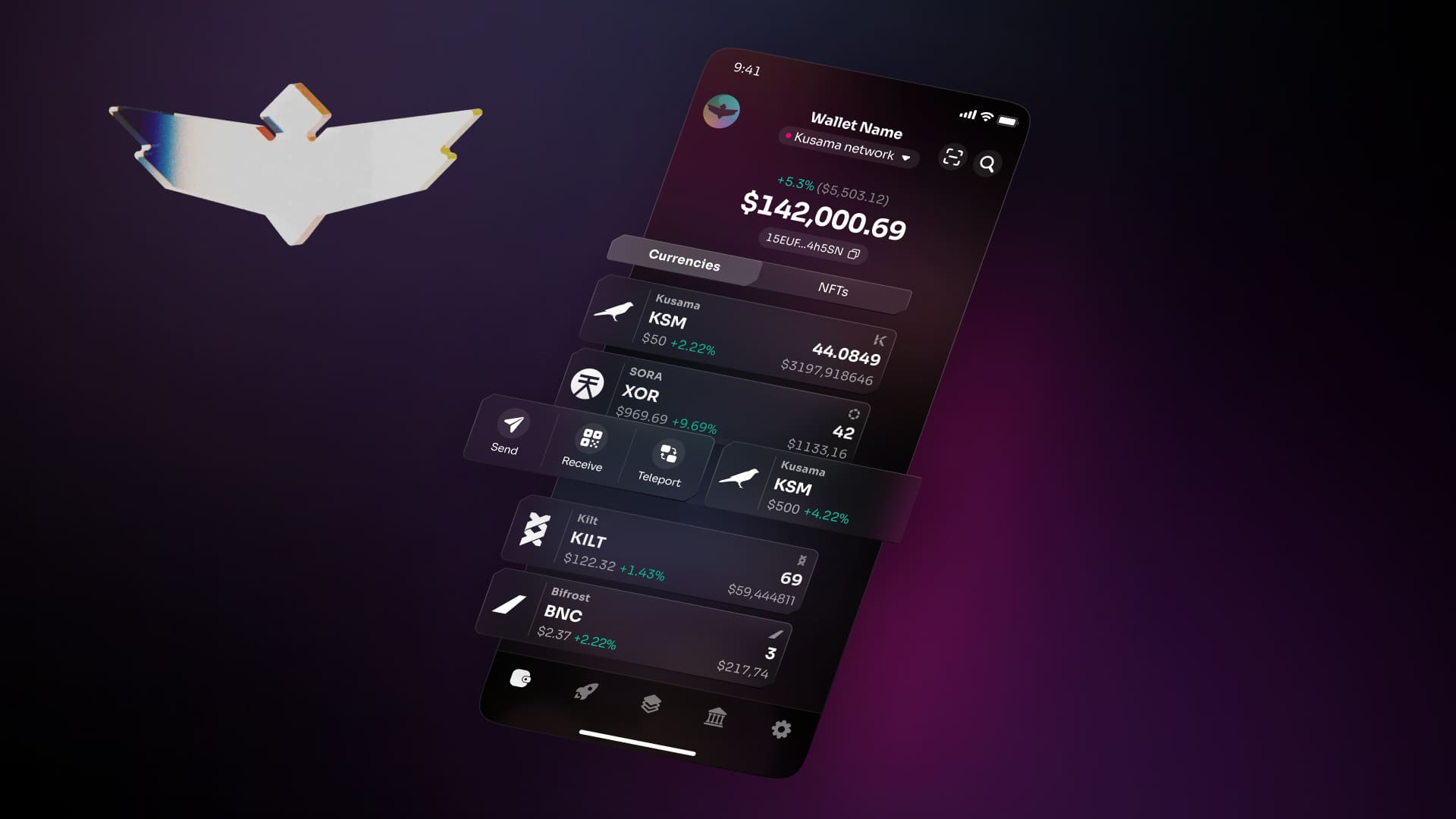
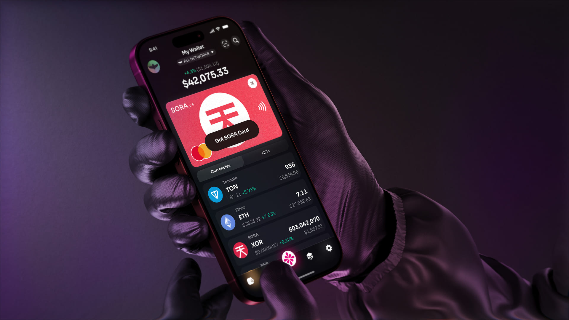
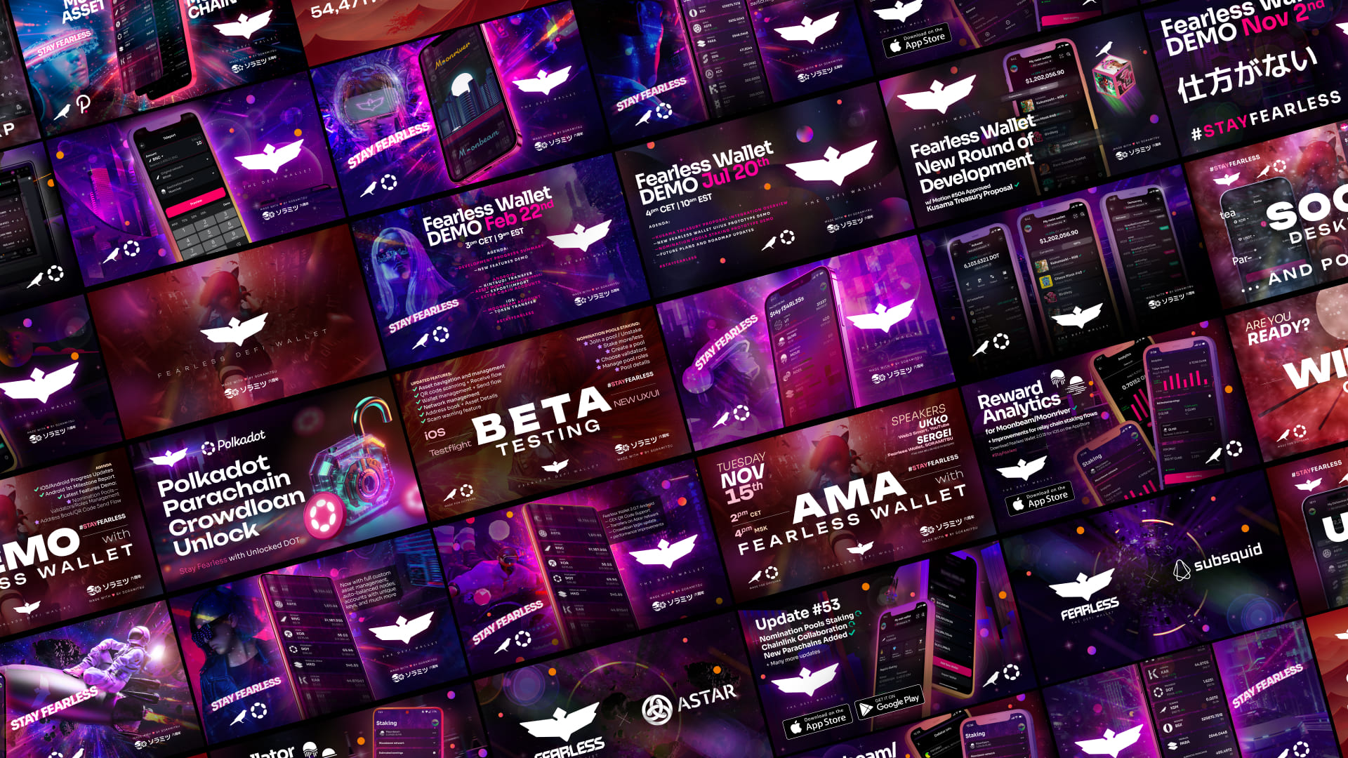
I created and continuously updated the UI style guide, adapting it as we expanded from a Polkadot/Kusama-only wallet to a multi-chain platform supporting 80+ networks. I also developed brand and design guidelines covering social media, marketing materials, video and audio content, ensuring the fearless identity extended consistently across every touchpoint.
UX at Scale
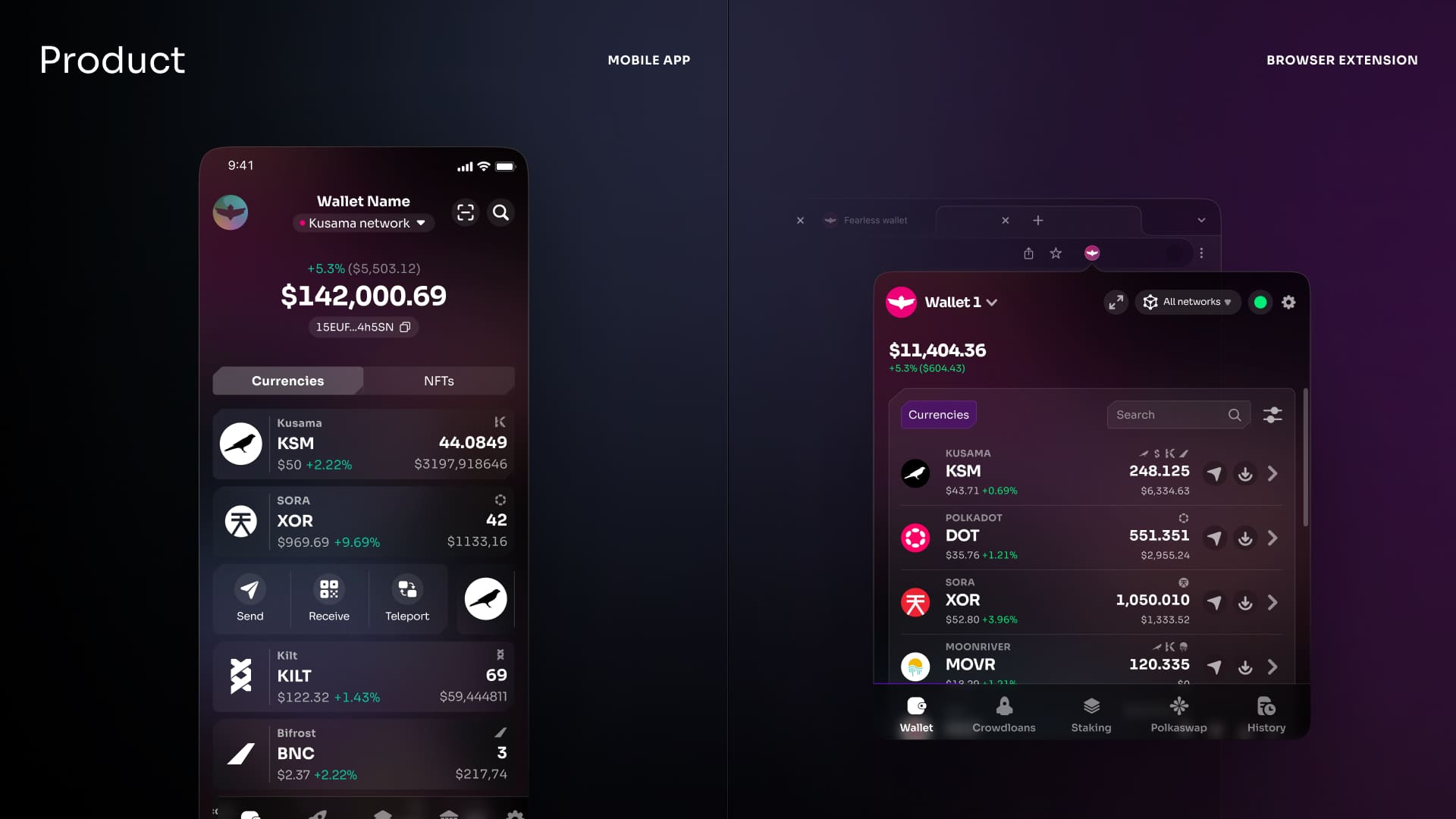
As the product grew, so did its complexity. We went from supporting 3 networks to 80+. We added staking, crowdloans, cross-chain transfers (XCM teleports), in-app token swaps (Polkaswap), Nomination Pools, dApp signing, NFT support, and EVM compatibility for the entire Ethereum ecosystem.
My role evolved from hands-on designer to design leader and back again, often in the same week. As Chief Design Officer, I led a team of designers while also regularly rolling up my sleeves for UX reviews, solving interaction problems, and crafting UX copy. I worked closely with the product owner throughout, ensuring design quality never slipped as the feature surface area expanded.
Some of the UX challenges I'm most proud of solving:
- ·Multi-network asset management. Users managing tokens across dozens of networks needed a way to see everything at once without drowning in information. We designed a filterable, customizable dashboard that let users choose which networks to surface, turning chaos into clarity.
- ·Universal transfer flow. A single, unified transfer screen that handled any-to-any token transfers across networks, with intelligent defaults and clear parameter controls.
- ·Staking information architecture. Balancing the needs of beginners (who just want to earn rewards) with power users (who want granular validator control) through progressive disclosure: simple by default, powerful when you need it.
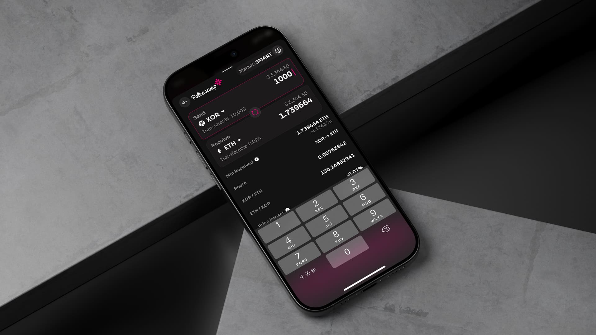
- ·Polkaswap integration. This offered a way to trade Polkadot-native assets on a DEX alongside bridged Ethereum tokens, giving users the ability to swap tokens without leaving Fearless Wallet.
The patterns we established in Fearless Wallet fed into the broader Superwallet initiative — Soramitsu's multi-brand, multi-platform design system that unified wallet architecture across DeFi and CBDC product lines. Fearless Wallet's modular flows, component structure, and interaction patterns became one of the primary inputs for a framework that could be themed and configured for any wallet product in the portfolio, from self-custodial DeFi wallets to government-backed CBDC apps.
Micro-interactions & Polish
I encouraged the team to invest in the details that make a product feel premium: subtle animations, thoughtful transitions, and interaction feedback throughout the app. In a space where most wallet interfaces felt utilitarian, these touches became part of the Fearless identity. Users noticed, and review after review cited the wallet's polish and ease of use as standout qualities.
Browser Extension
I designed the initial concepts for the Fearless Wallet Chrome extension and managed its design and UX at a high level alongside the product owner. The extension expanded the product's reach into desktop dApp interactions, enabling users to sign Polkadot and Ethereum transactions from their browser, or use their mobile app as a secure external signer.
Social Media & Marketing Design
Beyond the product itself, I created the entire visual design system for Fearless Wallet's social media and marketing presence. This wasn't a set of templates I created once and walked away from. I constantly revamped and reimagined the visual style to keep content fresh and engaging. Original graphics, evolving visual themes, campaign-specific design directions, always pushing to make the brand feel exciting and never repetitive.
Impact
Reflection
Fearless Wallet taught me that in emerging ecosystems, design isn't just a competitive advantage. It can be the thing that makes an entire technology accessible. When we started, millions of people were effectively excluded from participating in Polkadot because the tooling assumed developer-level knowledge. By obsessing over UX simplicity, crafting a distinctive visual identity, and sweating the details that make a product feel trustworthy, we helped open the door.
The project also reinforced something I believe deeply: brand and product design aren't separate disciplines. The cyberpunk-inflected identity, the animated micro-interactions, the social media aesthetic, and the staking flow. They're all part of the same experience. Users don't separate "brand" from "product." They feel it as one thing, and it either earns their trust or it doesn't.