2020–2025
Polkaswap
The DEX that redefined what DeFi could feel like
Overview
Polkaswap is a cross-chain decentralized exchange built on the SORA network within the Polkadot ecosystem. I created the brand identity, led the product design from concept through five years of evolution, and grew the design practice to a 6+ member team. The product shipped with technology that was genuinely first-of-its-kind (on-chain liquidity aggregation, a hybrid AMM and order book, cross-chain bridges) and the design had to match that ambition.
Polkaswap launched on April 27, 2021, as the first DEX in the Polkadot ecosystem with on-chain liquidity aggregation and cross-chain bridges. Built on Substrate technology, it delivered CEX-like speed and near-zero fees in a fully decentralized package. The SORA network has since processed over 18 million transactions, with Polkaswap as the primary user-facing application.
The Opportunity
In early 2020, the Polkadot ecosystem was emerging as the most technically promising alternative to Ethereum. Faster finality, lower fees, native cross-chain interoperability. The infrastructure was there. What was missing was a DeFi layer that took full advantage of it.
Every DEX at the time was essentially a Uniswap fork with a different color scheme. Same AMM model, same pool fragmentation problems, same impermanent loss, same clunky UX borrowed from Ethereum's gas-heavy paradigm. We saw a gap: Polkadot's Substrate framework could power something fundamentally different: a DEX that aggregated liquidity from multiple on-chain sources, bridged assets across ecosystems, and actually felt fast and effortless to use.
Soramitsu, as the company behind Cambodia's national digital currency system Bakong and core Polkadot infrastructure (Kagome), had the engineering depth to build the technology. My job was to make sure that technology translated into a product people actually wanted to use, and a brand that signaled this wasn't just another DeFi clone.
We secured a Web3 Foundation grant to build Polkaswap as the liquidity hub of the SORA economic system: a decentralized, non-debt-based monetary framework with its own elastic token supply, stablecoin infrastructure, and governance model. The vision was big. The design had to carry that weight.
My Role
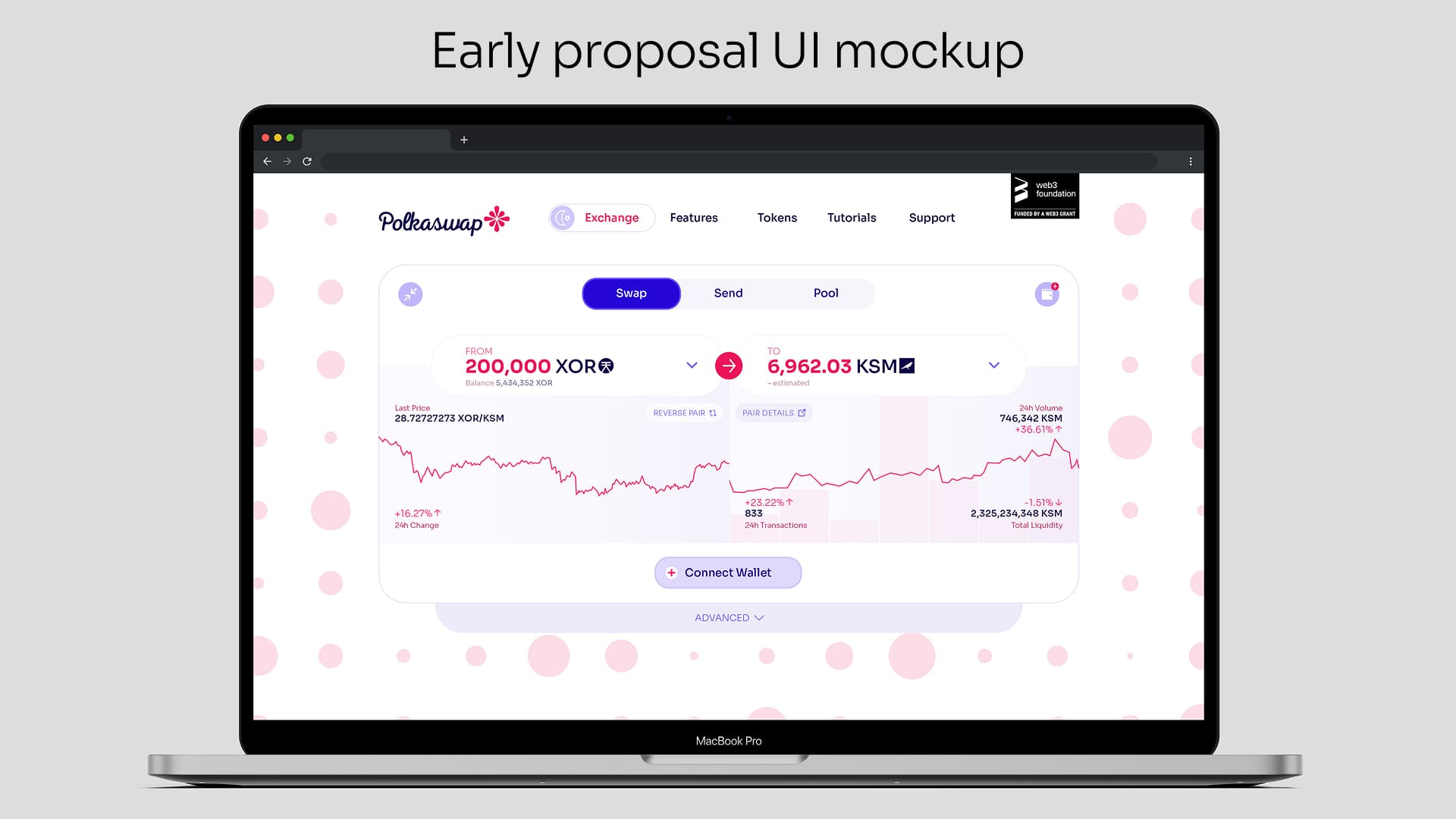
I joined the project as Head of Design and Brand and was responsible for the complete visual identity and product design foundation from day one. This included creating the Polkaswap brand identity, visual language, and design guidelines; designing the initial web app mockups that were part of the Web3 Foundation grant proposal; building and maintaining the UI style guide; and establishing the product's visual direction and design principles.
I was promoted to Chief Design Officer at Soramitsu in March 2021, a month before Polkaswap launched. That timing is important: by launch day, the entire organization's design output was directly my responsibility. After launch, I managed two product designers alongside the CEO and product owner through the critical early growth period, and spent the next five years leading a growing design team of 6+ members, working both hands-on and at a strategic level across Polkaswap, SORA Wallet, and the broader product portfolio.
The Challenge
Making Complex Technology Invisible
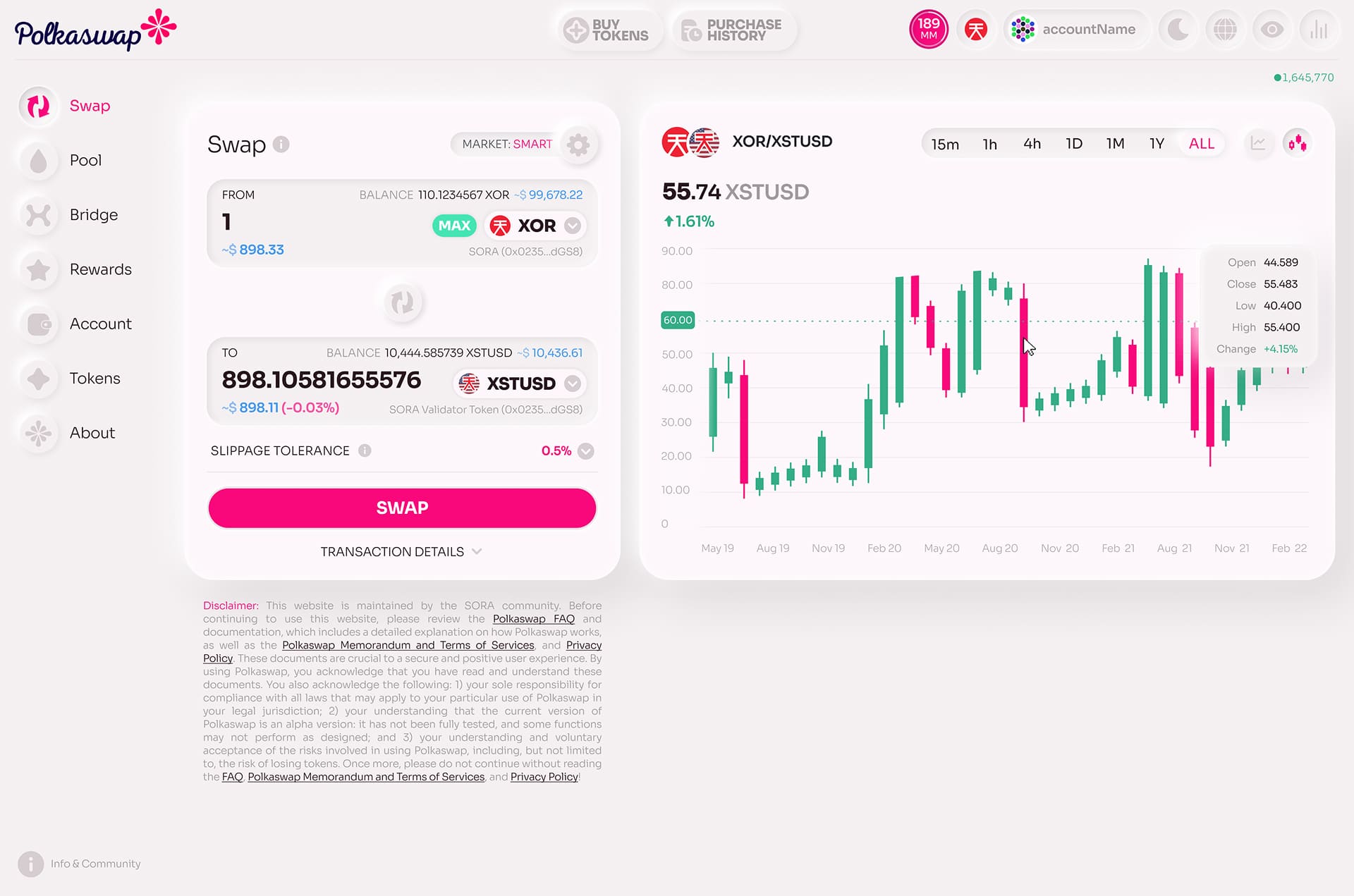
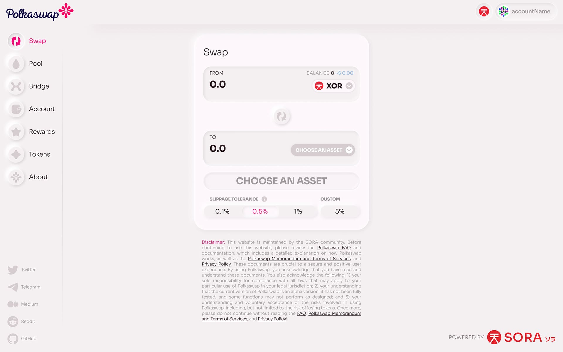
Polkaswap isn't a simple swap interface. Under the hood, every trade is routed through a liquidity aggregation algorithm that compares prices across XYK pools, a Token Bonding Curve, and a fully on-chain order book, then fills the order from the best composite source. Users also interact with cross-chain bridges, LP farming, staking, governance, an integrated stablecoin platform (Kensetsu), and a built-in account management system.
The challenge was presenting all of this without making users feel like they needed a PhD in decentralized finance. The product needed to feel simple on the surface while exposing depth for power users who wanted it.
Standing Out in a Sea of Fork-and-Ship DEXs
DeFi interfaces are known for dark backgrounds, neon accents, cluttered dashboards. Every project looked like it was designed by the same person on the same afternoon. If Polkaswap's technology was genuinely a generation ahead, the design couldn't look like everything else.
Matching the Brand Promise
Polkaswap's tagline was "Trade with Style and Freedom." The brand imagery leaned into a lifestyle feel (relaxed, confident, effortless) inspired by the idea of someone casually making trades from an infinity pool at sunset. The product interface needed to deliver on that promise: smooth, soft, fast, classy, modern. Not a financial terminal. An experience.
Approach
Brand Identity and Visual Language
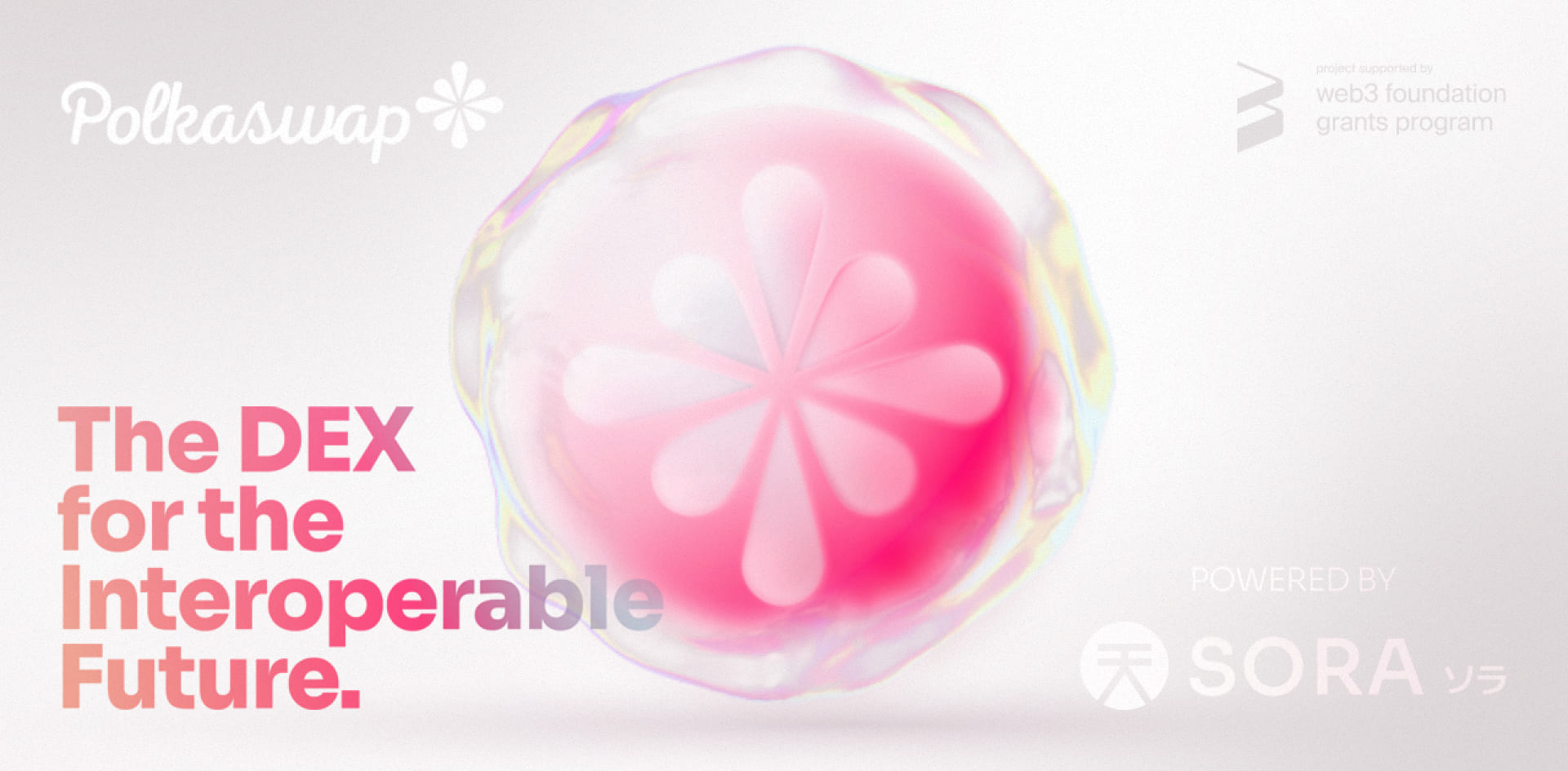
I created Polkaswap's brand from scratch: logo, color system, typography, iconography, illustration style, social media templates, and brand guidelines. The visual language was built around soft, flowing forms and a palette that felt premium rather than aggressive, deliberately moving away from the harsh neon-on-black aesthetic that dominated crypto.
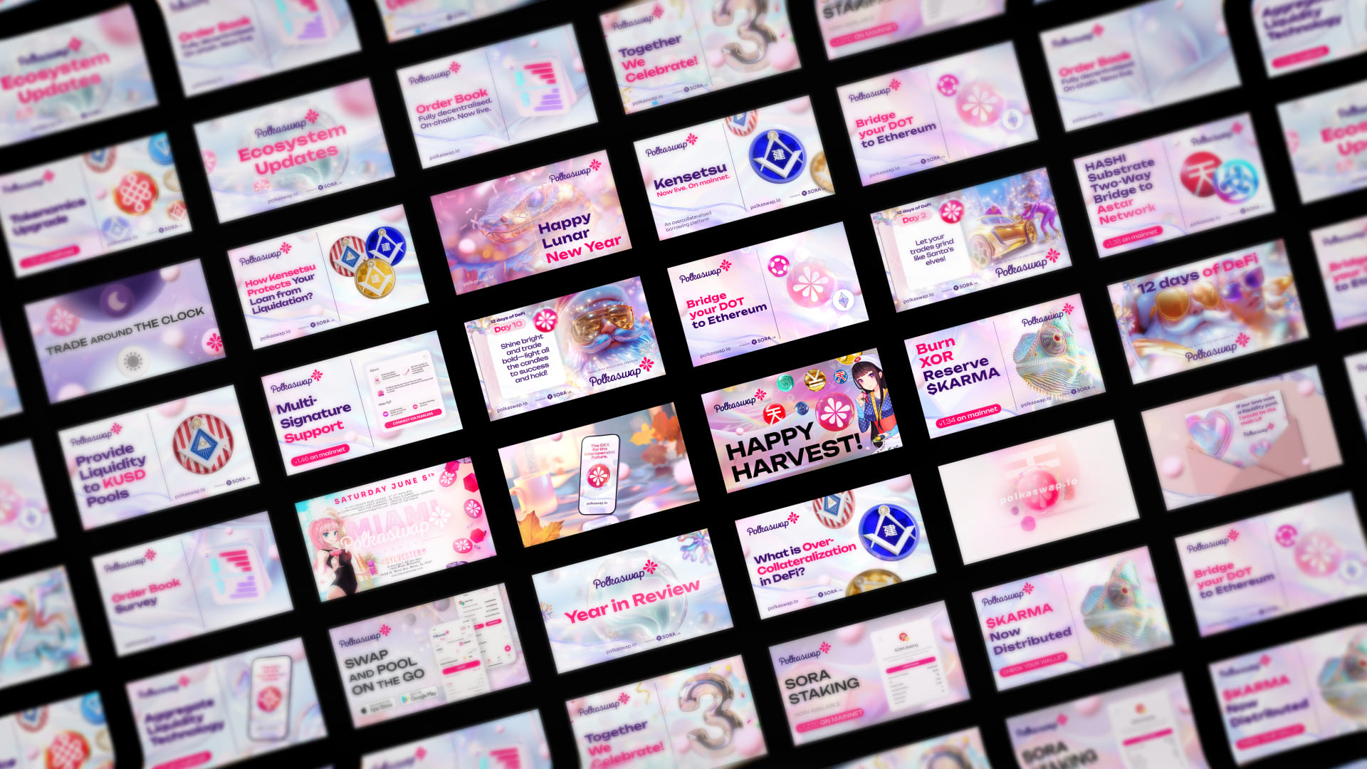
The brand extended into guidelines for social media, video content, and marketing materials. I constantly revamped visual styles across campaigns to keep the content feeling fresh rather than falling into template repetition. The result was a library of original graphics and visual assets that gave Polkaswap a distinctive, recognizable presence across channels.
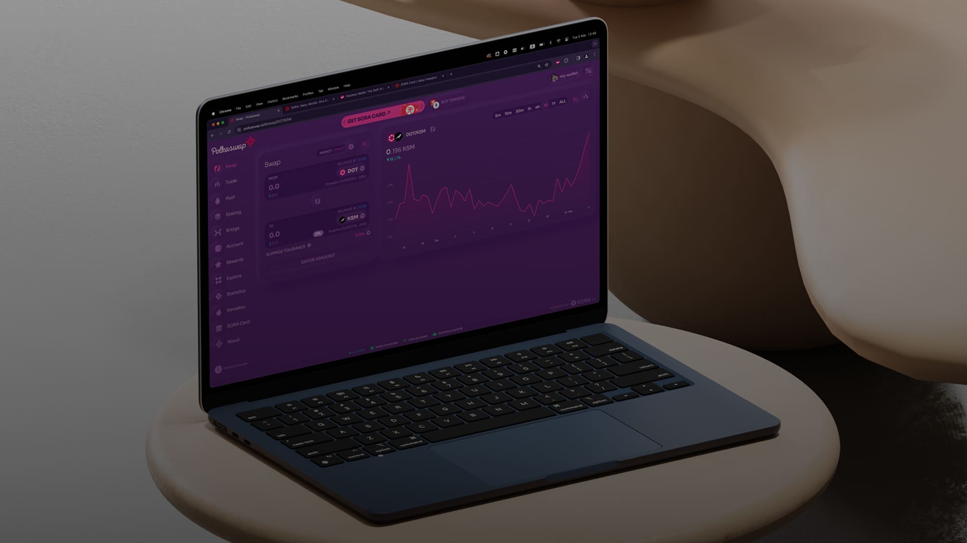
The Neumorphic UI
For the launch interface, I pushed for a neumorphic design language: soft 3D shadows, subtle depth, smooth rounded surfaces that felt almost tactile. The reasoning was deliberate: Substrate (Polkadot) technology made Polkaswap genuinely faster and cheaper than any Ethereum DEX, and the UI should speak to you the moment you see it. This isn't the same thing you've used before. This is something new.
The product manager and front-end engineers argued the neumorphic style was unnecessary complexity, difficult to implement and maintain. But design isn't only about function. How a product makes someone feel matters. The visual impression sets expectations, communicates quality, and creates emotional resonance that pure UX optimization cannot. Luckily the CEO shared this conviction and backed the direction fully.
The 36-Hour Launch Sprint
Two days before Polkaswap's public launch on the most popular crypto YouTube show at the time, the UI still didn't look right. The neumorphic styling wasn't implemented at all, and there were layout and structural issues that undermined the brand promise we'd spent months building. As CDO, the design output of the entire organization was my responsibility. If we shipped a product that didn't match what we'd been presenting to the community, that credibility gap would land on me. But more than that, I knew it could be better, and it deserved to be better.
So I did something a CDO doesn't typically do. After an already busy 12-hour day of work, I opened the Vue/TypeScript codebase, and for the whole night till the next morning, I wrote CSS overrides and HTML adjustments directly in the front-end code. They weren't elegant; I was essentially hacking style overrides on top of the component architecture rather than refactoring at the component level. But they worked, since I tested everything locally in the browser after each change I made. The carefully refined shadows and colors landed, the visual feel snapped into place.
The morning arrived and as the team across different time zones came online there was significant resistance from engineers. My changes weren't scalable, weren't architecturally correct, and broke their workflow conventions. But the CEO stepped in and instructed the team to take what I'd built and make it production-ready. The front-end team reviewed my changes, confirmed nothing was broken, and we shipped.
The product launched with those changes live that same night. Over the following weeks, the engineering team properly refactored everything into the component system. The visual direction held. The lesson I took from it: sometimes the right thing to do is grab the wheel, even if it's not your wheel to grab.
Research-Driven Iteration Post-Launch
Before launch, there was no time or budget for formal user research. We studied every existing DEX and DeFi product in the market, made informed assumptions, and validated decisions internally with the team. We shipped based on conviction and domain expertise.
After launch, that changed. We built an ongoing research practice around the Polkaswap community, gathering feedback through Telegram, governance discussions, support channels, and structured outreach. Over the years, multiple UI improvements and feature refinements were directly driven by what users told us and what we observed in their behavior. Some of the most impactful UX changes (simplifications to the rewards flow, refinements to the bridge experience, improvements to asset discovery) came directly from this continuous feedback loop rather than internal assumptions. Being daily users of the product ourselves kept us honest about pain points, but the community consistently surfaced things we'd normalized.
Noir Mode — Rethinking Dark Interfaces
When it came time to add a dark theme, we deliberately rejected the standard approach. Instead of a conventional dark mode (black/near-black with cool blue accents), we created Noir mode: a warm, deep purple-maroon palette.
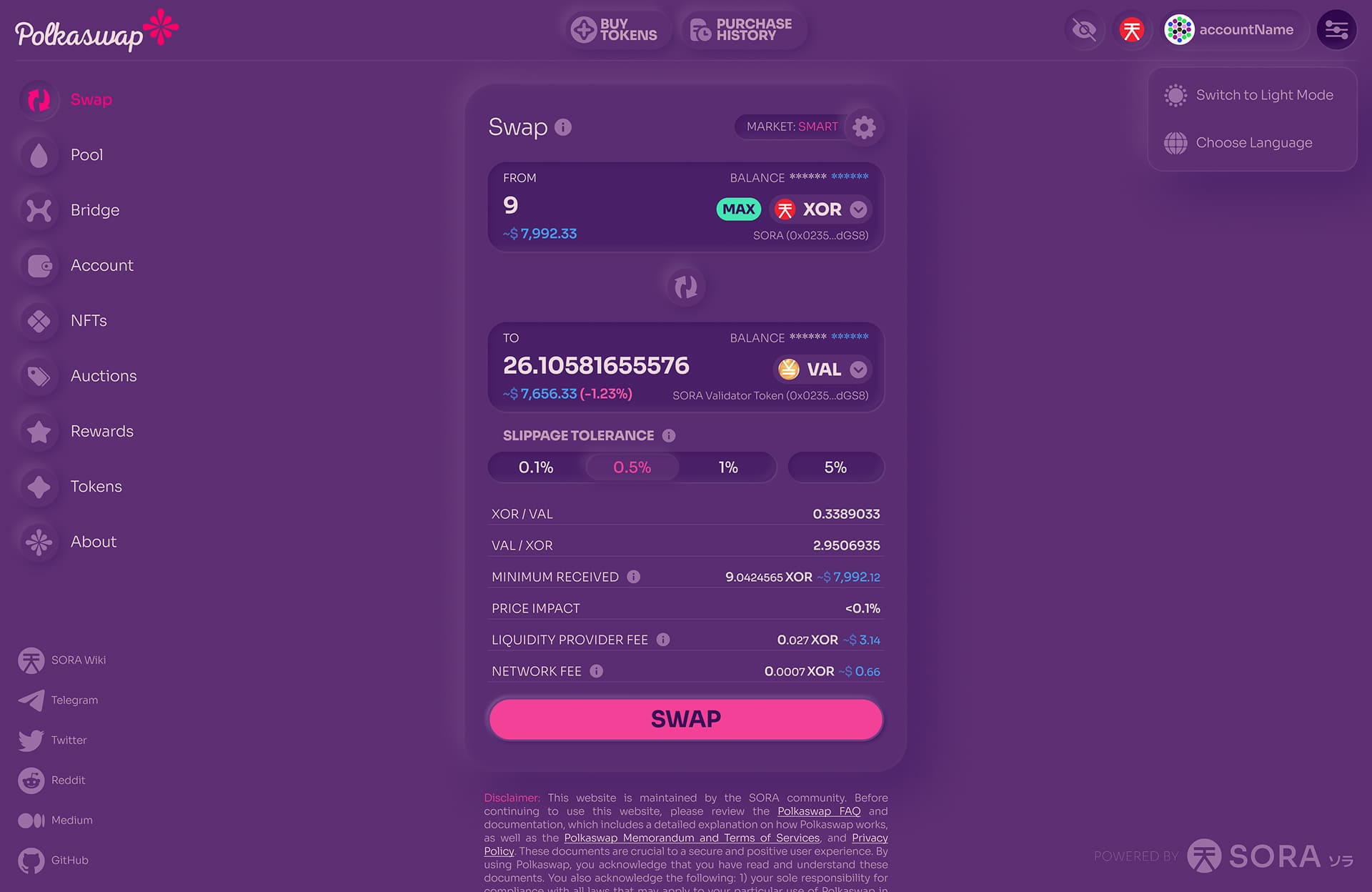
The thinking was grounded in research on screen exposure and eye comfort. Cool blue light from dark interfaces disrupts circadian rhythms and creates eye strain during extended nighttime use. Noir mode's warm palette sits closer to the red/orange spectrum, which is significantly easier on the eyes in low-light environments. With a device night-light filter enabled, it shifts to an even warmer maroon tone that feels almost soothing compared to the typical crypto interface.
It was a small decision with outsized impact on how the product felt during those late-night trading sessions that are so common in crypto.
Solution Highlights
Invisible Farming — Eliminating DeFi's Worst UX Pattern
Traditional DeFi farming is a UX nightmare: deposit tokens into a pool, receive LP tokens, find a separate farm interface, stake your LP tokens, then later unstake, remove liquidity, and hope you don't lose track of anything. Users end up with mysterious tokens in their wallets and no clear picture of what they've earned.
We eliminated all of this. On Polkaswap, when you provide liquidity to a pool, you're automatically farming. No separate staking step, no confusing LP tokens cluttering your wallet, no second interface to find. The underlying reward algorithms are sophisticated. They incentivize early participation and long-term commitment through minimum thresholds and time-weighted bonuses. But that complexity is completely invisible to the user.
This was a genuine UX innovation in DeFi. We took one of the most confusing user flows in the entire space and made it feel like it doesn't exist.
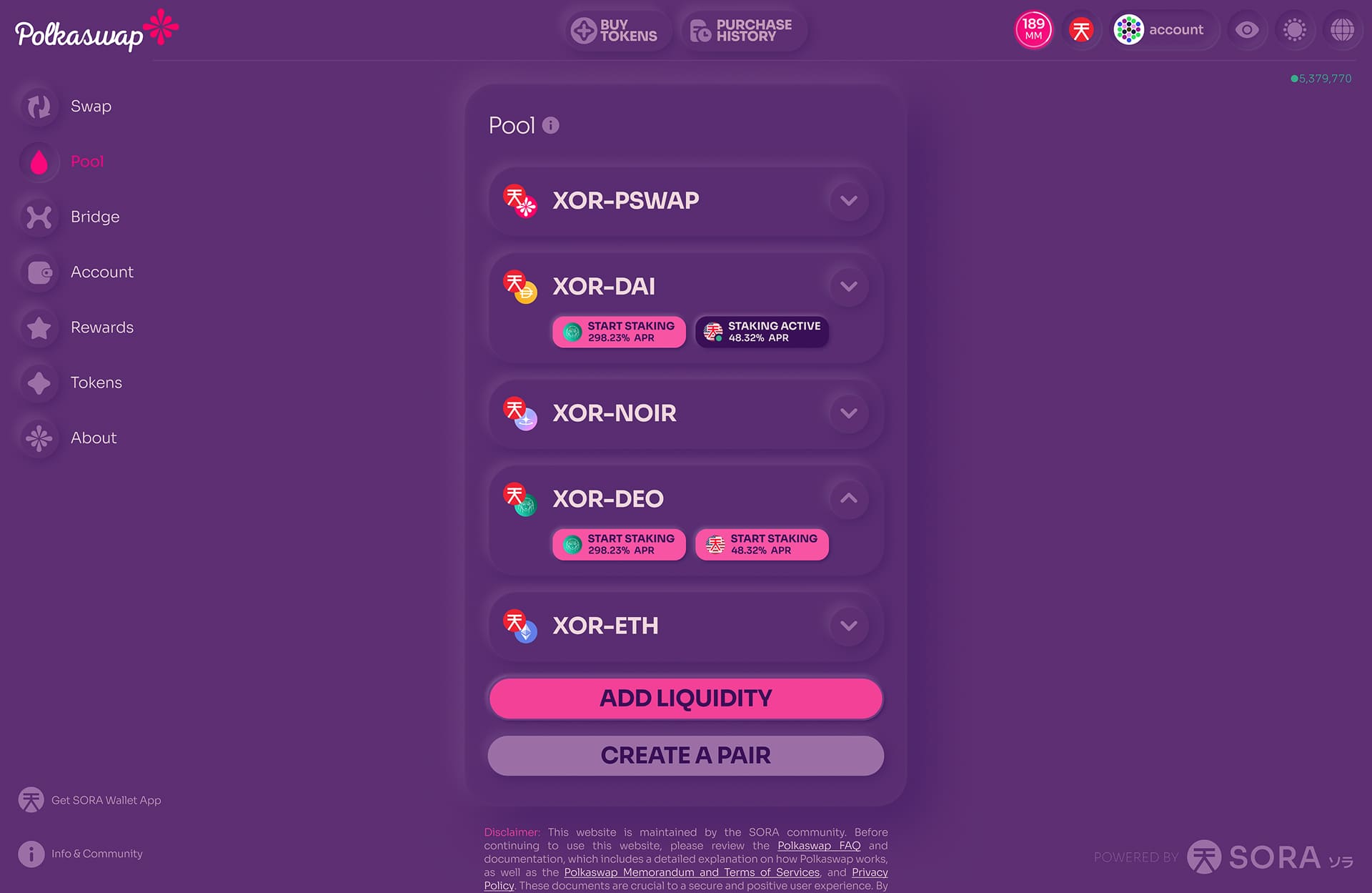
We took the same approach with Demeter, a third-party staking platform built on SORA by the Ceres team. Instead of sending users to a separate app, we embedded Demeter staking directly into the Polkaswap pool and asset views. A "Start Staking" button on each eligible pool card. A slider to choose your percentage. Confirm. Done. Multiple staking options per pool with different reward tokens all handled cleanly in the same interface. Once active, the card showed a green "Staking Active" indicator with inline access to status, rewards, and removal. Same pattern for single-sided asset staking. Most users ended up staking through Polkaswap rather than the Demeter app itself, because the integration made the separate app unnecessary.
Unified Rewards Experience
All rewards from liquidity provision, strategic farming, staking, and referrals live on a single, clear Rewards page. Users see exactly how much they've earned across every program, with straightforward claim actions. No hunting through multiple interfaces, no wallet archaeology trying to figure out where yield came from.
Integrated Account and Asset Management
Unlike Ethereum-based DEXs where you need an external wallet interface to understand your holdings, Polkaswap features a built-in Account page. Users see their complete asset portfolio, balances, transaction history, and performance in one place. No need to manually add token contracts, no mystery tokens, no switching between apps to understand your position.
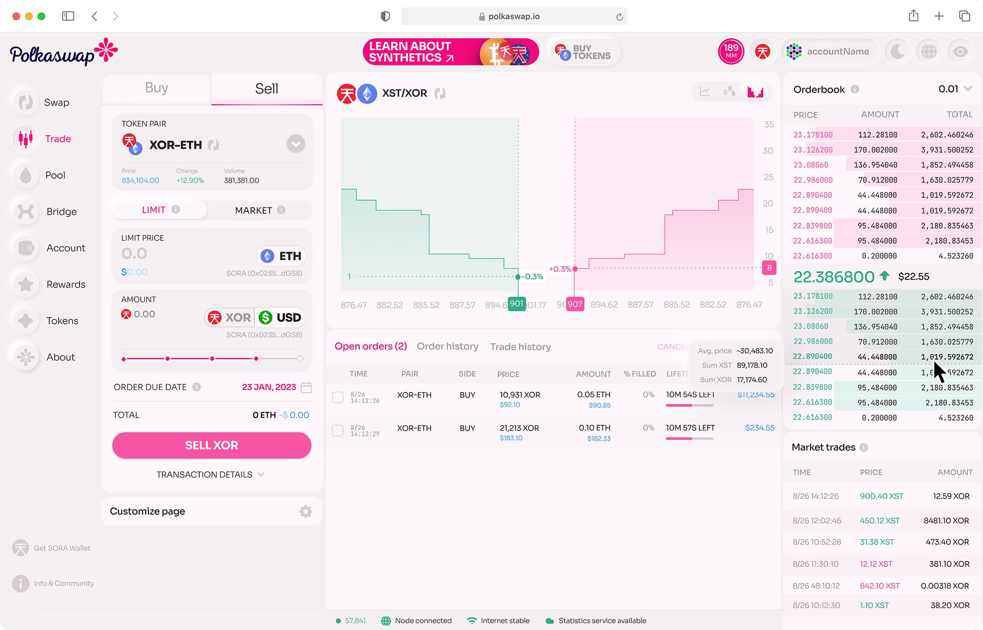
On-Chain Order Book Trading
When we launched the fully decentralized on-chain order book in early 2024, the design challenge was making it feel as responsive and intuitive as a centralized exchange. Market orders, limit orders, real-time market depth, order history, all running entirely on-chain with sub-second responsiveness. The trading interface delivers a CEX-grade experience on a fully decentralized protocol.
Kensetsu — Integrated Stablecoin Platform
Polkaswap also integrated Kensetsu, a decentralized, over-collateralized stablecoin platform built on the SORA network. Think MakerDAO, but community-driven and natively embedded inside the DEX rather than living as a separate product. Users can open vaults, lock collateral, and mint stable assets, all without leaving Polkaswap. The design challenge was making vault management, collateral ratios, and stability fees feel approachable for users who had never interacted with a CDP-style system.
Cross-Platform Consistency
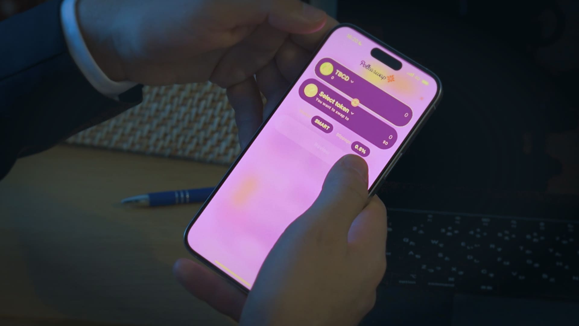
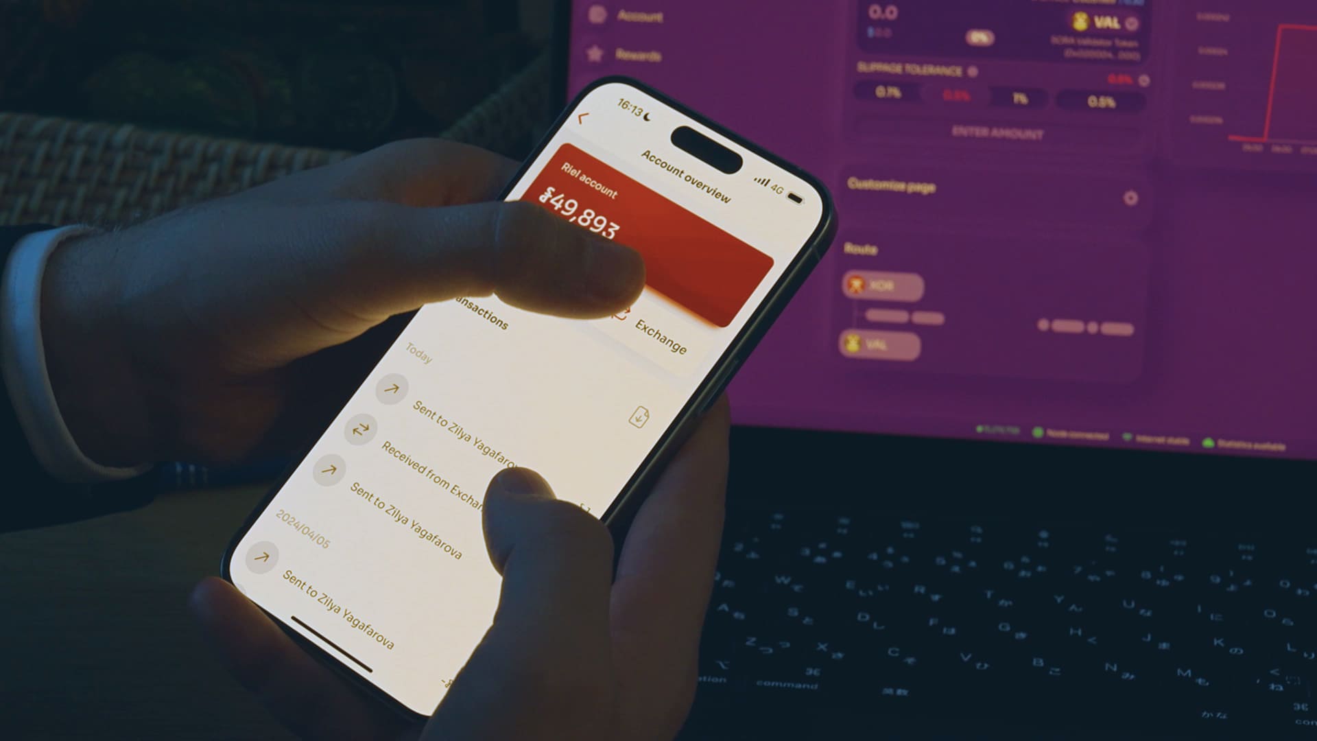
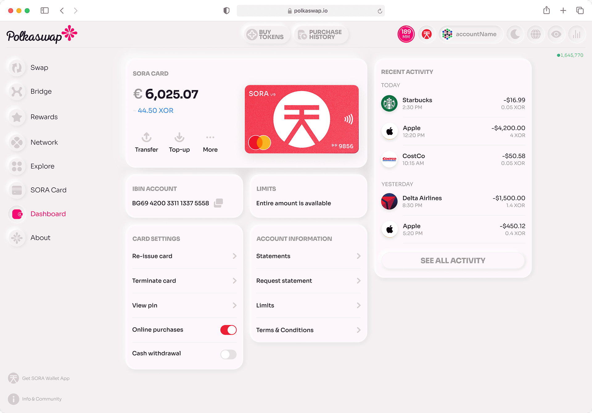
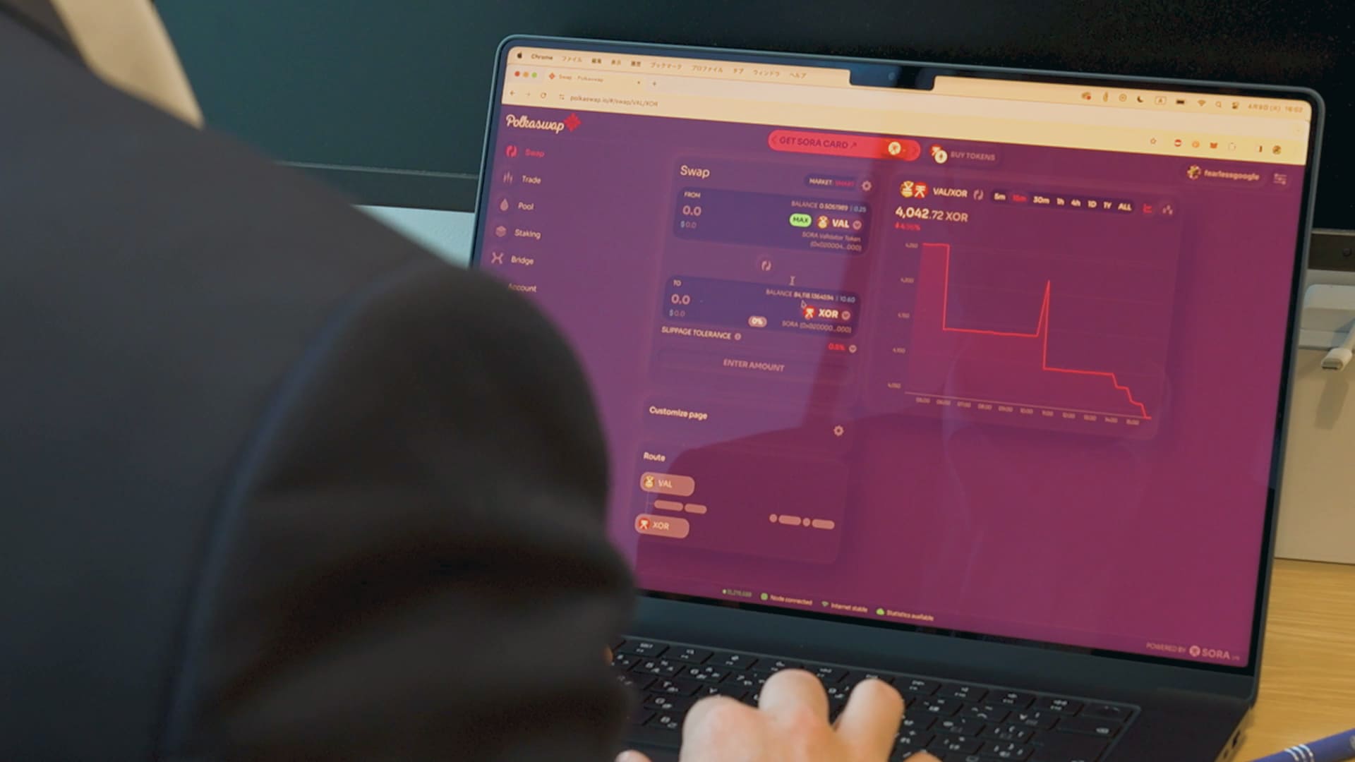
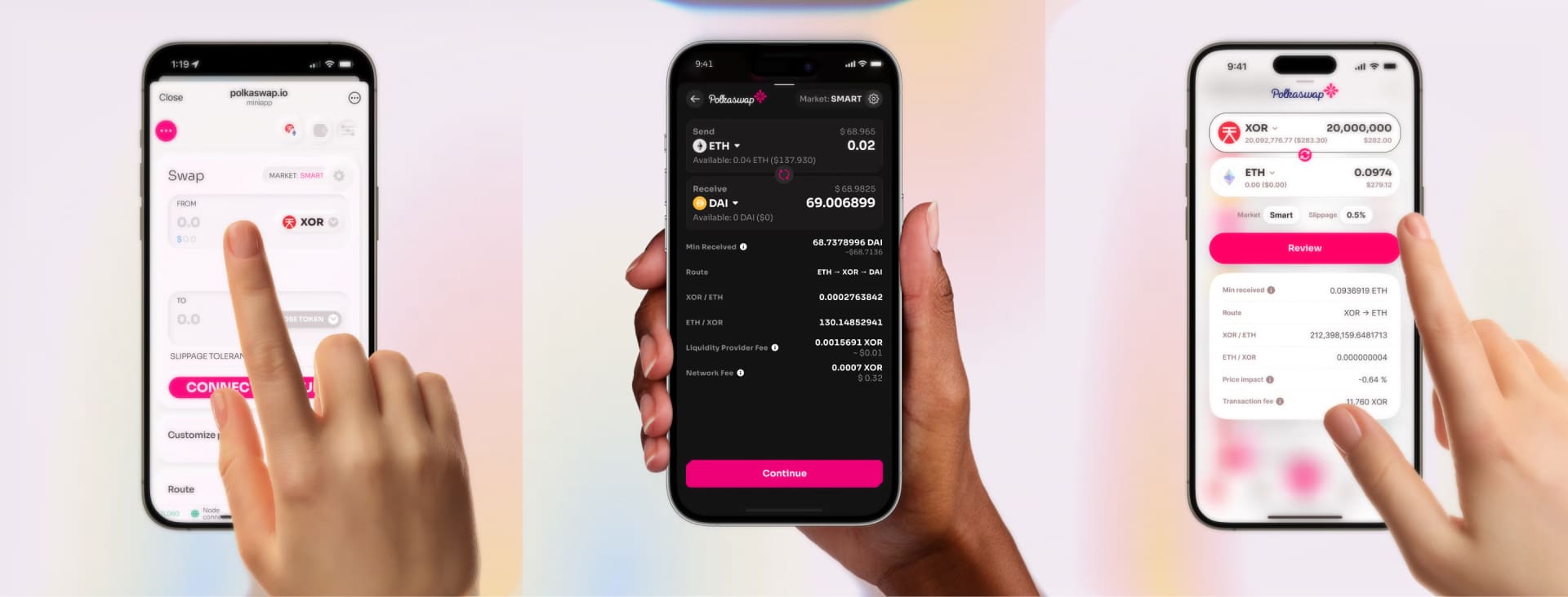
The Polkaswap experience extends across multiple form factors: the web app at polkaswap.io, a Telegram Mini App, integration within SORA Wallet (iOS/Android), and Fearless Wallet (iOS/Android/Chrome extension). I led brand and design consistency across these touchpoints, ensuring that the visual identity and interaction patterns held together regardless of where users accessed the product.
Continuous Visual Evolution
Over five years, I led multiple UI and branding "face lifts," rethinking and refreshing the interface to keep it feeling current and premium. Some of these I designed myself; others I directed through the growing design team. Each iteration refined the neumorphic language, improved information density, tightened interaction patterns, and introduced thoughtful micro-animations and transitions that gave the product a sense of polish and life.
From Product to Platform — The Design System
The Polkaswap front end became the foundation for Soramitsu's multi-brand, multi-platform web design system. As the interface matured through iteration, we extracted patterns, components, and visual primitives into a shared system that could serve radically different products while maintaining a consistent level of quality.
The system supported two visual modes: a smooth neumorphic style with soft 3D shadows and depth, and a clean flat variant that stripped away the dimensionality for contexts where simplicity mattered more. Both shared the same underlying component architecture, spacing, typography, and interaction patterns.
Products built on this system included the Iroha Explorer (blockchain data for Hyperledger Iroha-based networks), the FIL web app (Fraud Intelligence Limited, a telecom fraud detection platform), the ADAR web app (Advanced Digital Asset Routing, simplifying recurring payments for Web3 businesses), and Zenswap (a cross-chain liquidity protocol). Each had its own brand identity, but the shared design system meant new products launched at a higher baseline — consistent quality without starting from zero every time. What began as a single product's UI evolved into the design infrastructure behind Soramitsu's entire web portfolio.
Impact
Reflections
The biggest lesson from Polkaswap is that design conviction matters as much as design skill. The neumorphic direction, the Noir mode, the 36-hour launch sprint, none of these happened because they were the safe or easy choice. They happened because the team believed that a DEX could be beautiful, that how something looks and feels is inseparable from how well it works, and that shipping something exceptional is worth the friction of getting there.
Five years of continuous iteration also taught me that great product design is a practice, not an event. The Polkaswap that exists today is very different from the version we launched, not because the first version was wrong, but because the team never stopped asking how it could be better.
The insights we gained from research with the live community post-launch were the most valuable. DeFi users are notoriously hard to reach through traditional research methods, but observing real trading behavior under real market conditions consistently revealed things we couldn't have anticipated from assumptions alone. Design in DeFi isn't abstract. There's real money moving, real stress, real stakes. The best design decisions came from respecting that reality.